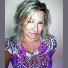
Had a fabulous day with a lovely group of ladies from "The Art and Business of Surface Pattern Design" e-course!! We met in New York City and attended Printsource's summer show. Printsource New York holds three shows a year, and is the premier show for surface and textile designs in the USA. I had a wonderful time walking around the show (my first surface design show!), talking to a few companies, and basically getting a feeling for the industry and what's in store for me going forward. We had a bite to eat midday, and discussed our career history, current projects, showed pics of the kiddos, our work, and traded business cards and info. It was so refreshing to meet everyone in person! I started this e-course in April, and I've had the pleasure to network and meet some extremely talented people, share tips (thanks Schatzi!!), and get instant feedback on new work and designs via Flickr, Facebook, and email. Thank you to Rachael and Beth for starting this outstanding e-course!
Please check out what each of these designers are up to:
Rachel Gresham | www.rachelgreshamdesign.com
Helen Billett | www.meringueinc.ca
Deborah Velasquez | www.deborahvelasquez.blogspot.com
Emine Ortega | www.emineortega.blogspot.com
Femi Ford | www.femiford.com
Tanya Brown | www.schatzibrown.com
Mary Tanana | www.groovity.blogspot.com (me!)
Thank you all, LET'S DO IT AGAIN!!!
...and just an FYI to any of you newbies finding my blog, The Art and Business of Surface Pattern Design, Module 1: Designing your way, is beginning August 27 2012!!! Here's the link for more info!! http://dowhatyouloveforlife.com/course/the-art-and-business-of-surface-pattern-design-module-1-designing-your-way/
About Me!!!

- Mary Tanana
- United States
- I'm a surface pattern designer, photographer, gardener, doing everything with a boho, edgy flair.
Showing posts with label Flickr. Show all posts
Showing posts with label Flickr. Show all posts
Thursday, August 16, 2012
Friday, June 29, 2012
Pantone's Color of the Year
I had to use Pantone's "Color of the Year", Tangerine Tango, (LOVE it) in a recent project. I took one of my existing patterns that I had previously done in 7 or 8 colors and made it into a two color design.
This one uses the same Pantone Tangerine color, with a beige. I think that I like the effect of these two colors together better than the brown. What a difference a color makes, eh?
Oh, and if you want to Pinterest any of my artwork or photography from here, please attach a link to this blog and give me credit. If you don't, I will find you and hurt you ;)
The comments from Flickr postings on this one boiled down to "vintage" styling. I used Tangerine Tango with a deep, rich, brown color.
Oh, and if you want to Pinterest any of my artwork or photography from here, please attach a link to this blog and give me credit. If you don't, I will find you and hurt you ;)
Subscribe to:
Posts (Atom)


